Museum and Museum Store Identity
As a team we researched information for our purposed museum for the city of Sacramento. With our collective information we were asked to create individual logos (1 logo mark and 1 logo type). For the museum, we created an identity system with our logos.
Museum Concept
The Atrium is an interactive museum looking to engage and educate young children (K-middle school) about the importance of trees, especially the ones found in our urban environment. The museums goal is to work with schools and act as a helping hand to educators in teaching natural science and environmentalism. The museum is composed of a large tree made from recyclable materials that can be explored through the level of the museum. People coming to museum would be able to learn more about trees and their impact through a shift in perspective. Canopy puts you at birds view, truck at small animal view, and root system at a bug's view.
The Atrium's mission -- to plant the seeds of knowledge for generations to come.
Logo
The Atrium logo appeals to children of all ages in the calming color scheme and its legibility. The tree form in the logo stands centered over the tagline as a subtle way to say that the museum is centered and rooted in the park and community.
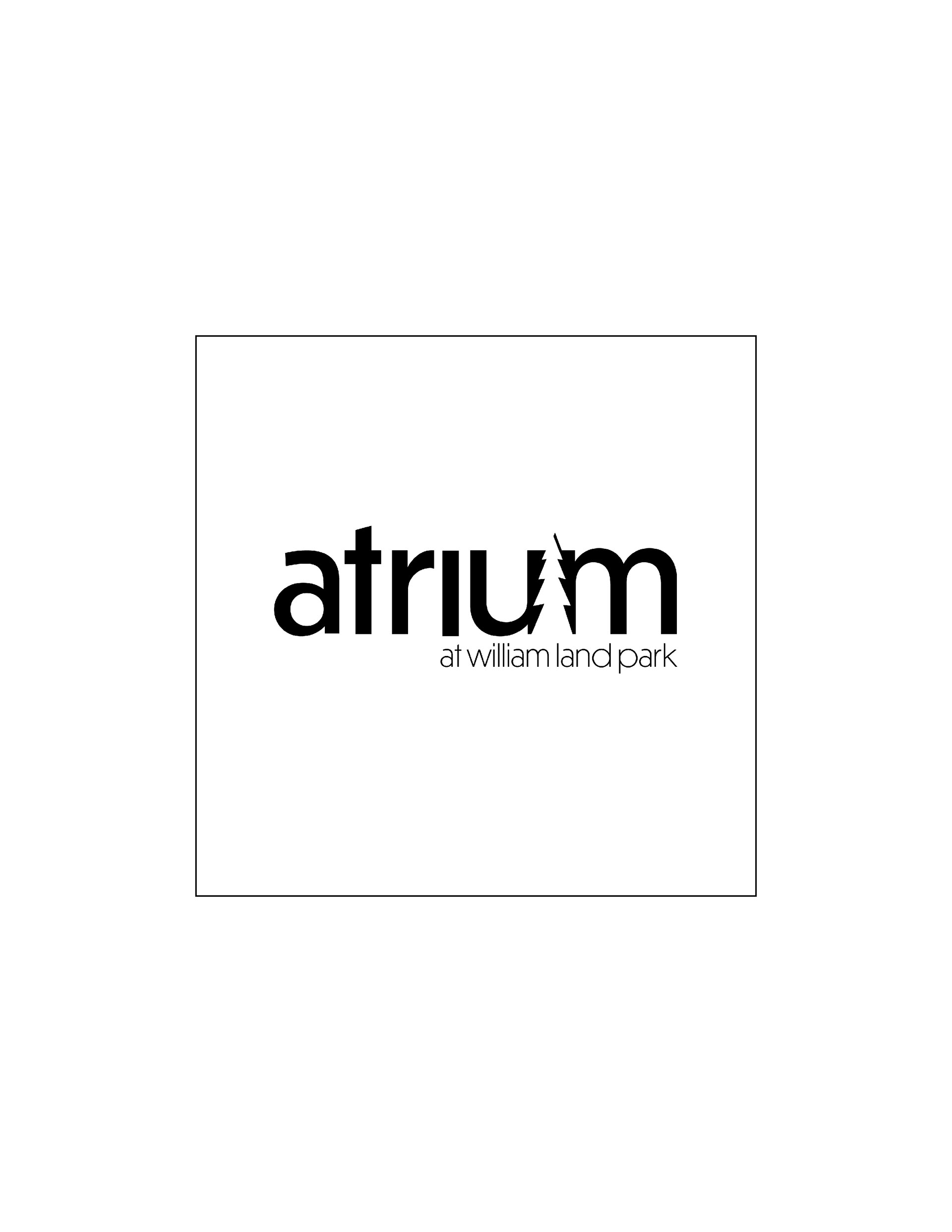
Black and White Logotype

Color Logotype in Brand Colors
Museum Identity Kit
The Atrium identity kit required a letterhead (8.5x11), standard business envelope, and business card. We were required to create a pattern that would be include either on the back of the business card and/or letterhead or on the flap of the envelope. My pattern was constructed from the tree form found in the the Atrium logo and uses the company's 3-color color system. I chose to incorporate the pattern on my business card to keep the letterhead and envelope simple and clean.
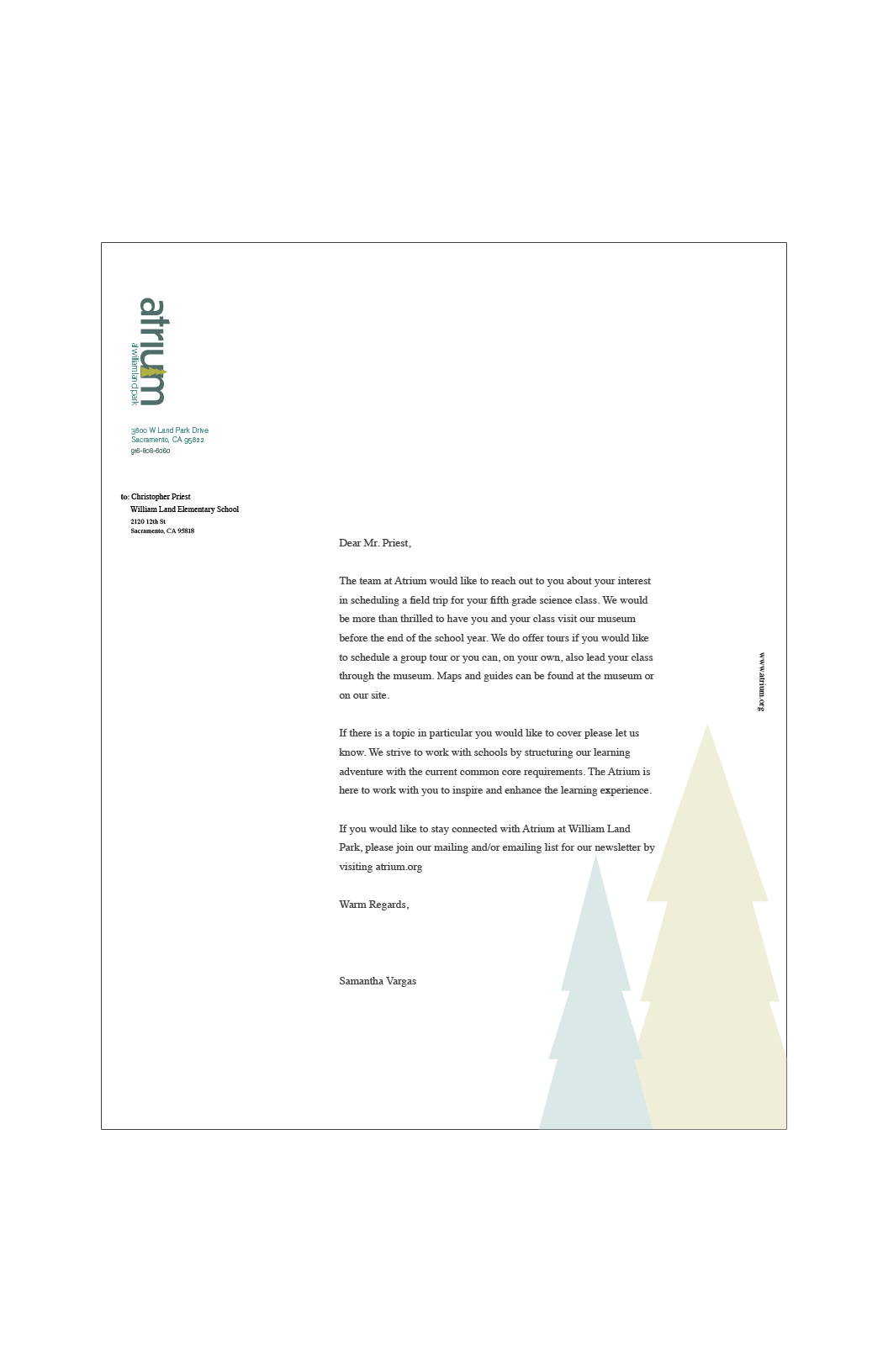
Letterhead 8.5x11
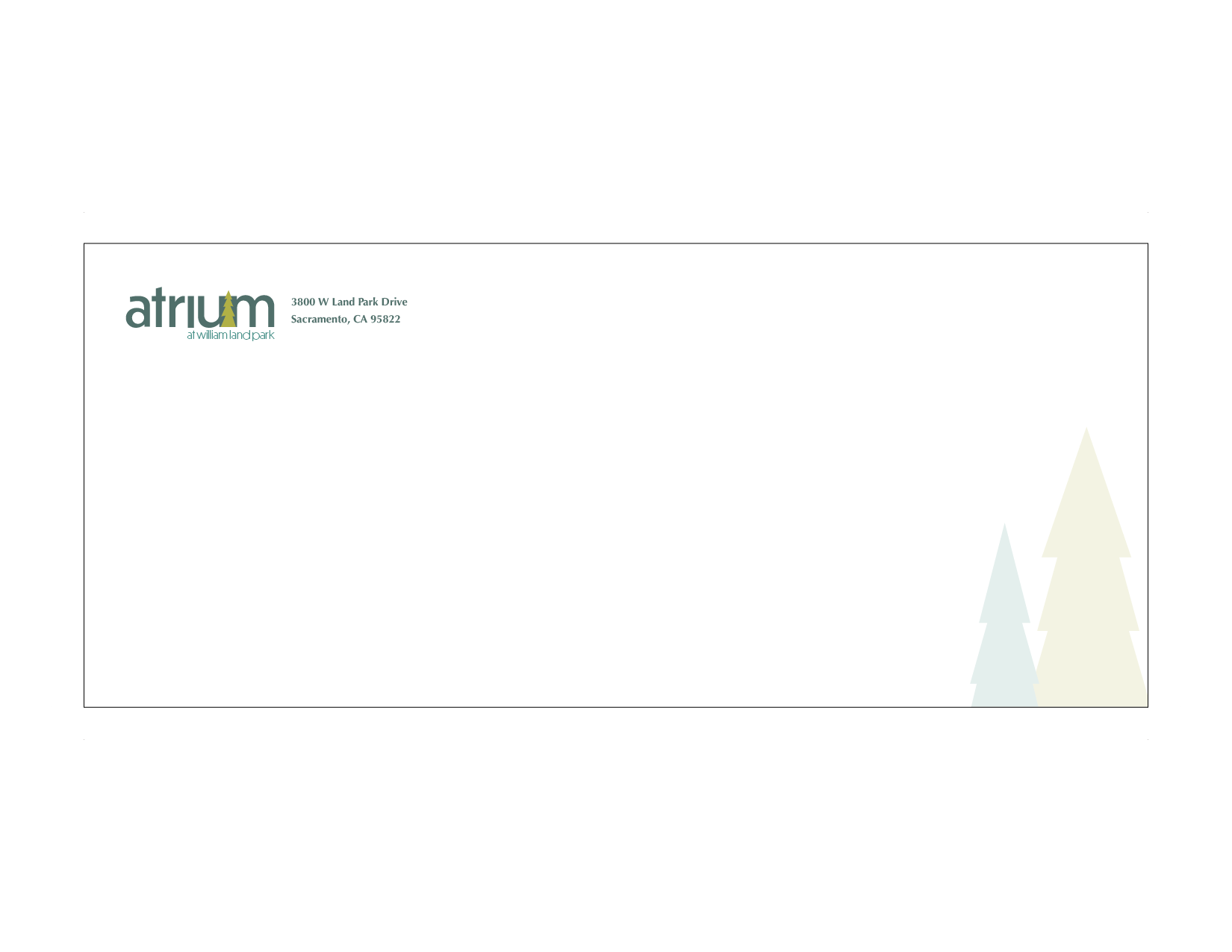
Envelope Standard Business Size
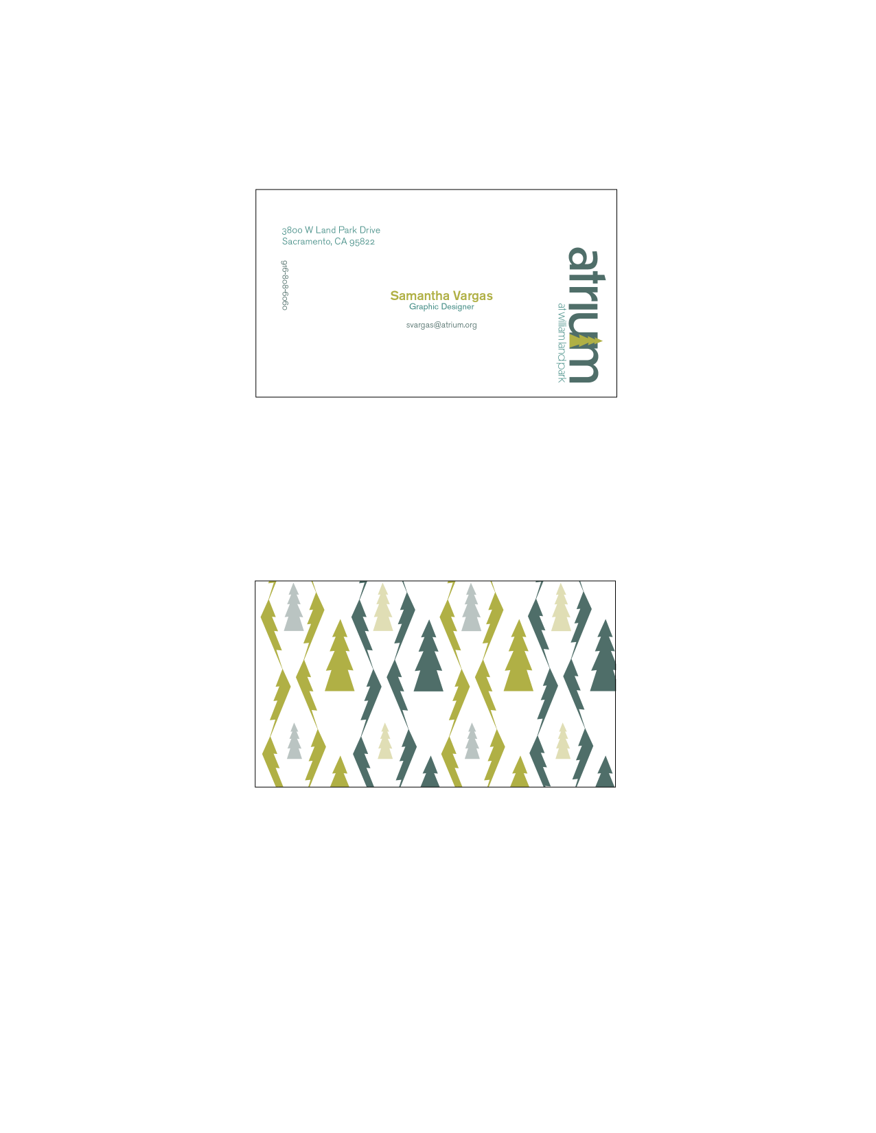
Business Card
Museum Shop Concept
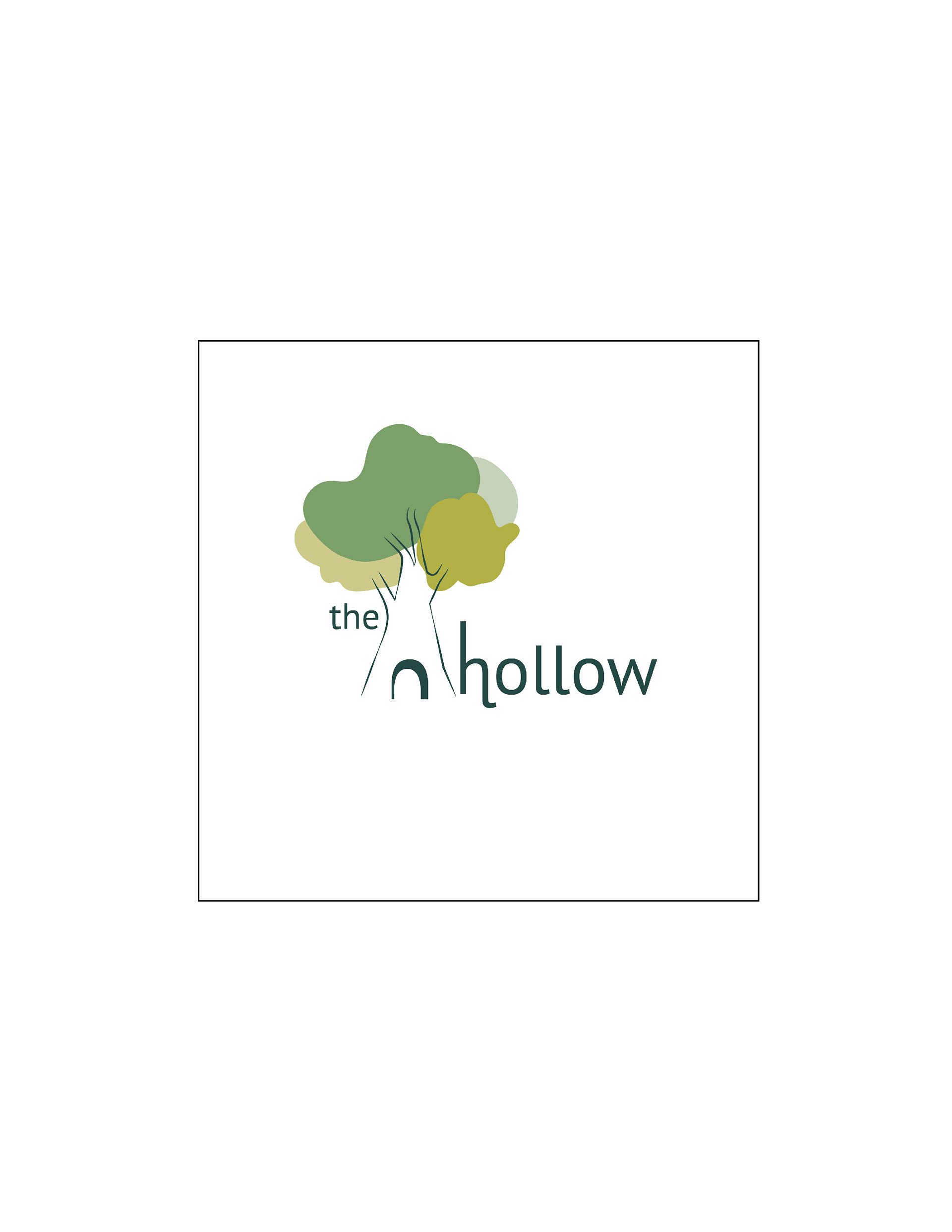
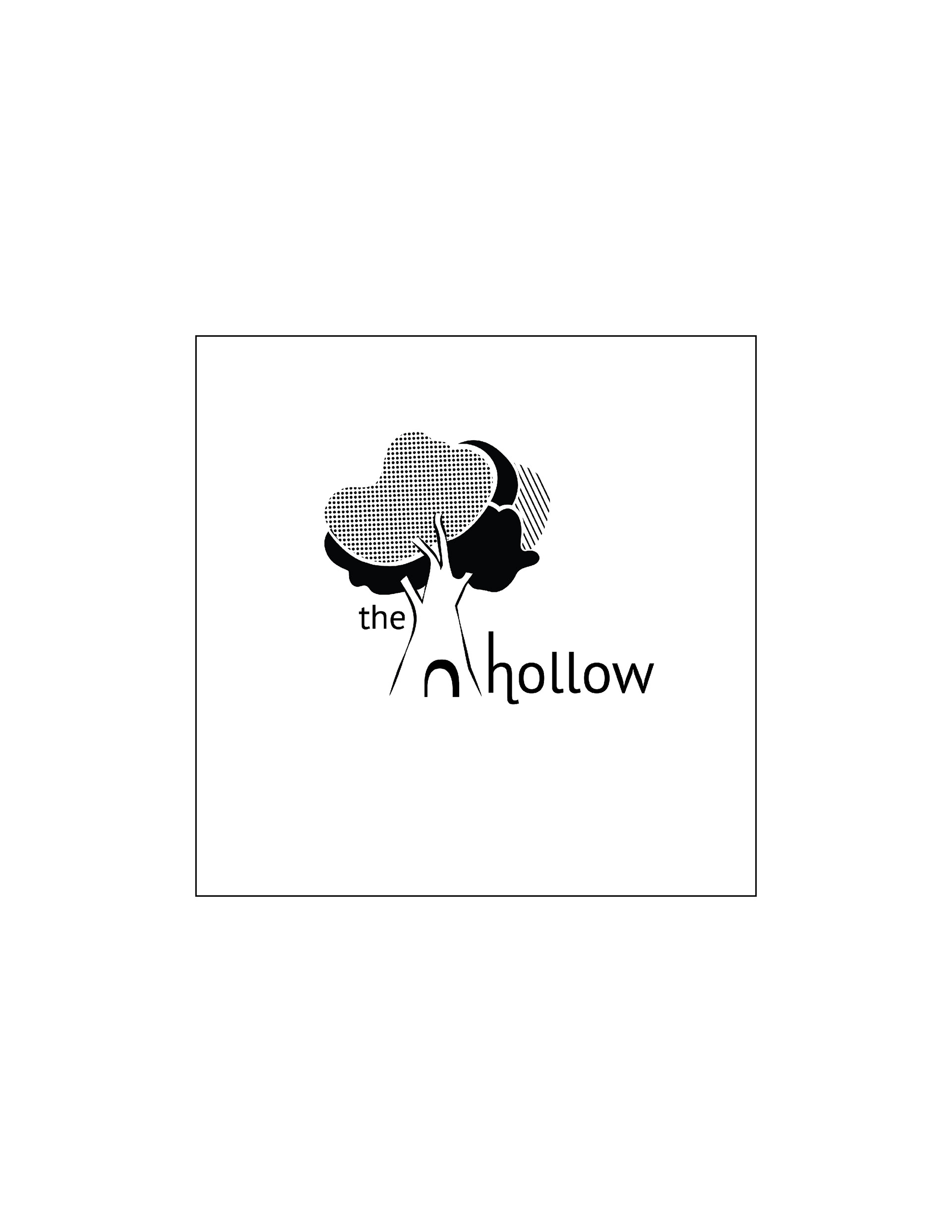
The secondary logo is for a craft shop within the Atrium. The Hollow is a paper making experience that teaches kids and families the art of making paper as well as the importance of recycling. The Hollow is a continuation on the Atrium's hands-on educating method. Through this interactive approach the Hollow works with the Atrium but also stands on it's own as a secondary point of interest for people.
Logo
The logo is meant to be fun and playful the tree is similar to the oak trees that are common to the area. The shapes in the tree are organic in style but echo the curves in the letter form of the logo. I chose to keep the color scheme similar to that of the museum to show that the two work together as well as stand alone.
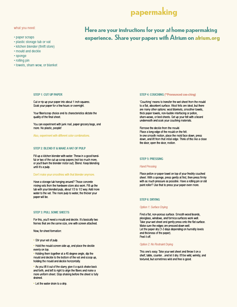
Physical Takeaway
A physical item that a guest can take home after experiencing the museum. For my personal take away, I created a DIY paper making kit that a guest would either purchase at the Hollow or in the Atrium. The goal of the kit is to keep the hands-on experience of the museum going even after the guest leaves.
The kit includes a mould and deckle, instructional sheet, as well as packets of glitter, dried flowers, and seeds that can be added into the pulp. Both the packets and the instructional sheet use the secondary colors in the system.

Top View-pattern created from tree symbol in the logo
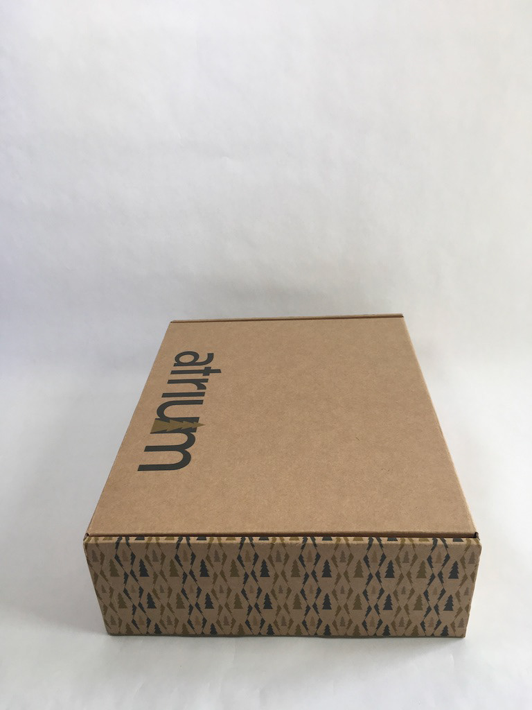
Pattern from business card incorporated on the side panels
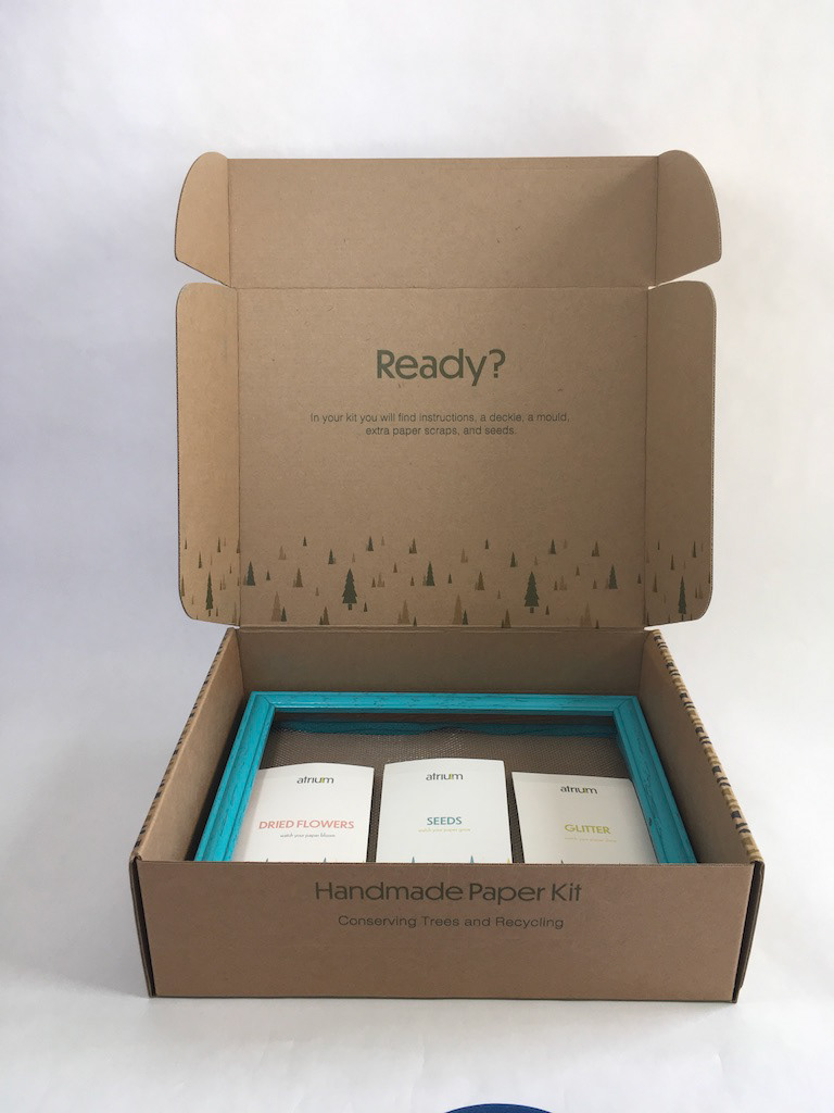
Open box featuring the packets and screens for paper making
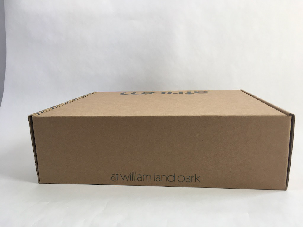
Back View-tagline